

The team at Awesome Corp aims to perpetuate positive energy by developing a single tool that people can use to share positive notes and expressions about the people, places, and things that matter to them the most. The Awesome App is designed to give individuals the “power” to share positivity in an easy and social context by integrating with other social media applications such as Facebook, Instagram, and Twitter.
An Easy Way To Share Positivity
Awesome
Awesome aims to perpetuate positive energy by developing a tool that people can use to share positive notes and expressions about the people, places, and things that matter to them the most.
Give an Awesome.
Change the world.
Give an Awesome.
Change the world.
The team at Awesome Corp aims to perpetuate positive energy by developing a single tool that people can use to share positive notes and expressions about the people, places, and things that matter to them the most. The Awesome App is designed to give individuals the “power” to share positivity in an easy and social context by integrating with other social media applications such as Facebook, Instagram, and Twitter.
The Challenge
Engaging with the Awesome team was an exciting opportunity, as they entrusted us with the pivotal task of crafting both the User Interface (UI) and User Experience (UX) for their upcoming mobile and web applications. This comprehensive project demanded the fusion of creativity and precision to deliver a design that not only captivated users visually but also streamlined their interactions across both platforms. Our approach focused on seamlessly integrating aesthetics and functionality, ensuring a cohesive and intuitive experience for users navigating the application on various devices and interfaces.
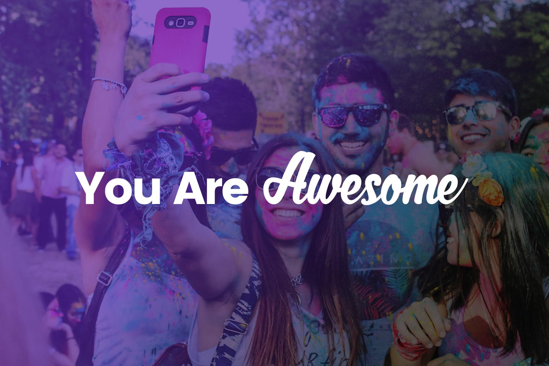
An “Awesome” is a fun way to celebrate a person, place or thing, share gratitude, and show appreciation. Positivity is powerful. Give an Awesome; Change the world!
UI/UX: Colors
The Awesome Color Palette incorporates a Awesome Red to represent willpower, leadership, and courage, and a Powder White to represent goodness, coolness, and simplicity.
Awesome Red
#C40000
Powder White
#DDDDDD
White
#FFFFFF
Positivity is really powerful.
Make the world more Awesome!

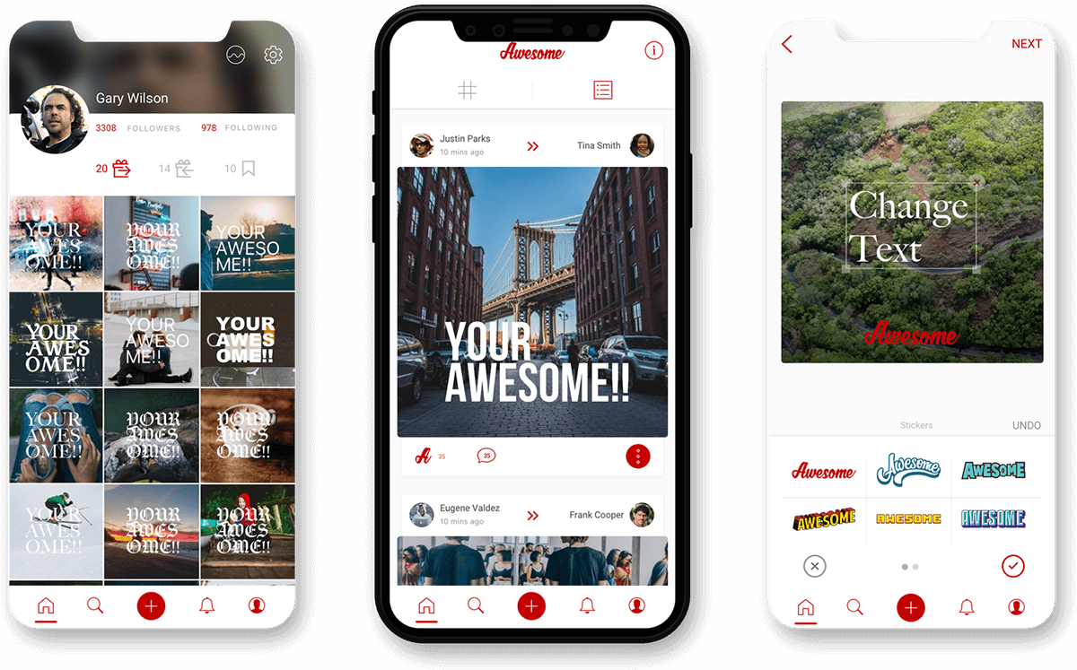
UI/UX: App Wireframes
Our wireframing process for the Awesome mobile app began with a meticulous analysis of the project’s requirements and user journey. We embarked on defining the skeletal structure of each screen, emphasizing clarity and functionality. Our approach prioritized user-centered design, ensuring that every wireframe element served a purpose in enhancing the overall user experience. Through iterative revisions and collaborative feedback sessions with the Awesome team, we refined these wireframes into a blueprint that provided clear guidance for subsequent design and development phases, setting a solid foundation for the project’s success.


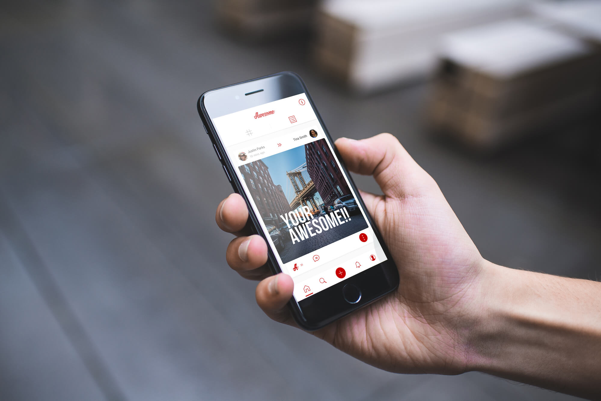
UI/UX: App Design
After finalizing the wireframes for the Awesome mobile app, our focus shifted towards translating these structural blueprints into a visually appealing and user-friendly interface. Our design process centered around aligning the app’s aesthetics with the brand identity and user preferences. We designed typography and graphical elements to create a cohesive and engaging user experience. By maintaining consistency with the wireframes, we ensured that the final design not only met but exceeded the client’s expectations. The result was a harmonious fusion of form and function, enhancing the overall usability and visual appeal of the Awesome app.


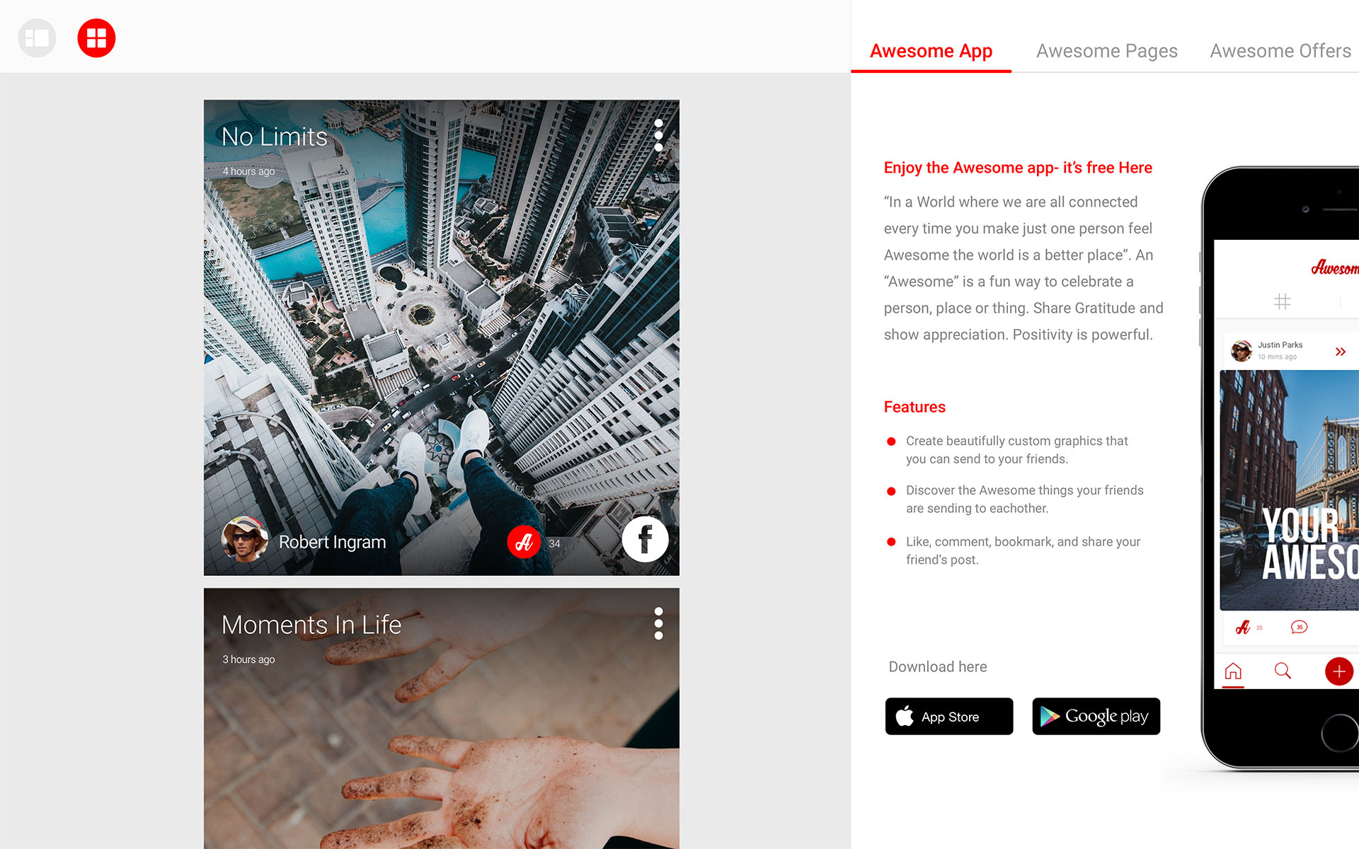
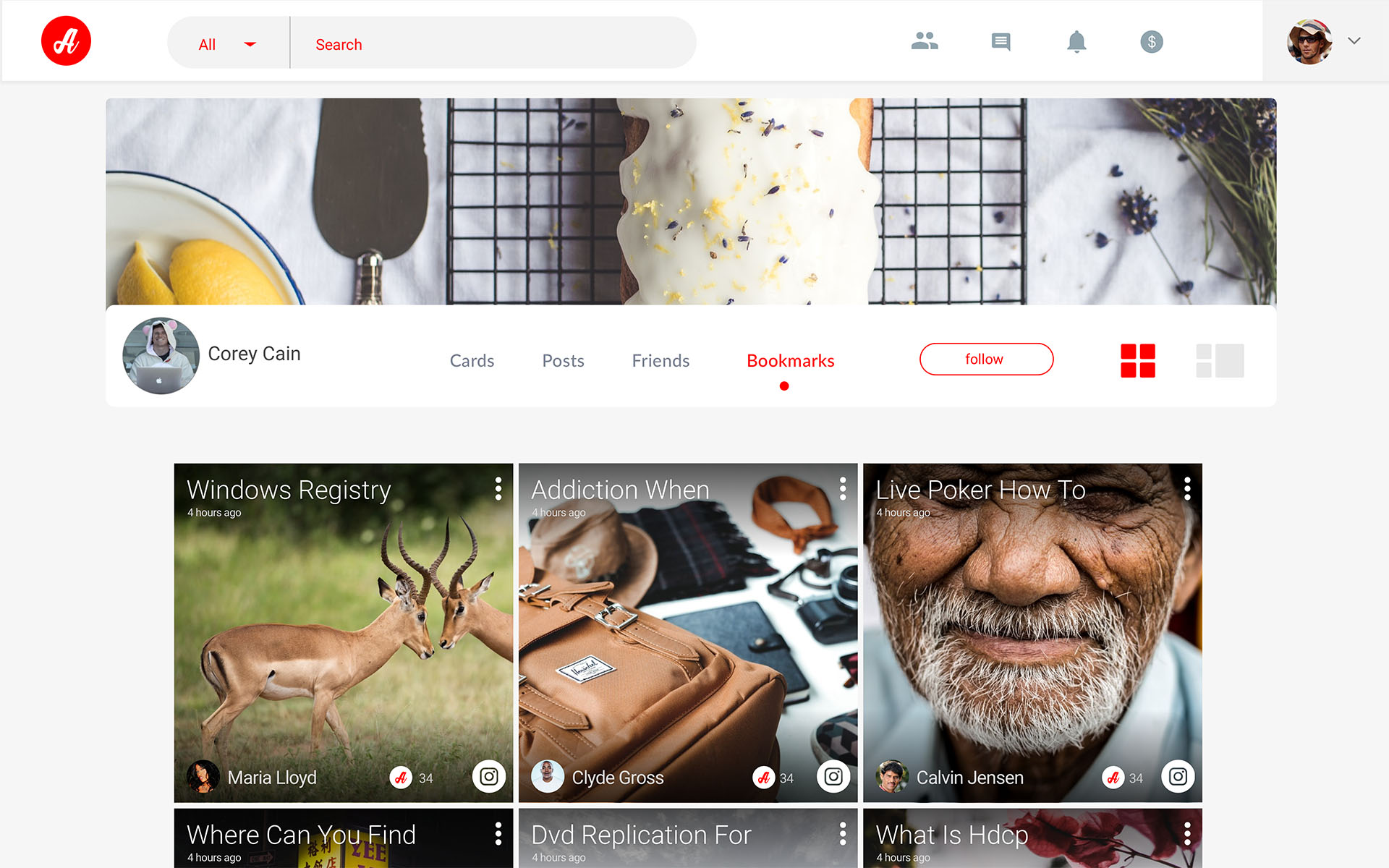
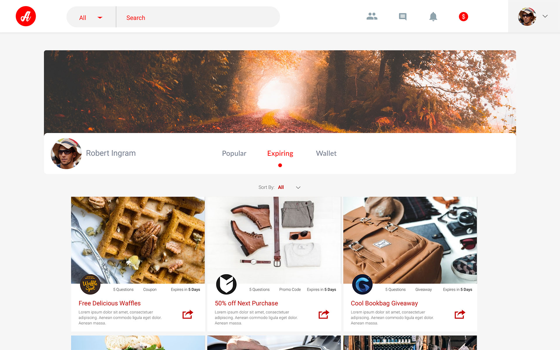
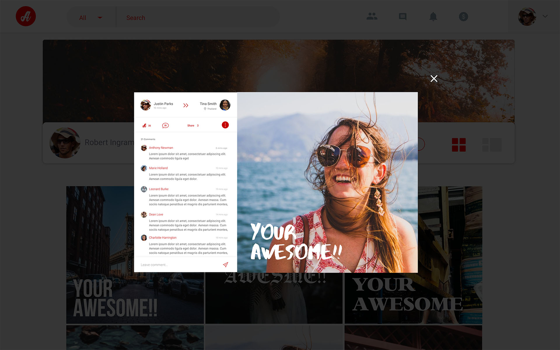
UI/UX: Website Design
In designing the user interfaces for the website, we considered the various features and distinct user flows that were a part of the project roadmap. Our approach involved a comprehensive analysis of user journeys, ensuring that each feature seamlessly integrated into the interface. We focused on maintaining consistency and coherence across both the mobile app and website, allowing for a unified and intuitive user experience. This included optimizing navigation, interactive elements, and visual cues to ensure that users could transition between platforms.


