
No Losing, Inc. is a lifestyle brand, movement, and non-profit with a mission to lead people into a lifestyle of Winning. As a non-profit, No Losing provides both programs and initiatives throughout the city of Atlanta that inspire people to embrace a lifestyle of winning in the areas of relationships, career, finance, and health. No Losing’s target market includes teens and young adults, ages 13-35.
Leading People into a Lifestyle of Winning
No Losing
No Losing, Inc. is a lifestyle brand, movement, and non-profit based in Atlanta, GA with a mission to lead people into a lifestyle of Winning by implementing a diverse array of programs and initiatives throughout the Atlanta area.

We’re Not Losing Anymore!

We’re Not Losing Anymore!
No Losing, Inc. is a lifestyle brand, movement, and non-profit with a mission to lead people into a lifestyle of Winning. As a non-profit, No Losing provides both programs and initiatives throughout the city of Atlanta that inspire people to embrace a lifestyle of winning in the areas of relationships, career, finance, and health. No Losing’s target market includes teens and young adults, ages 13-35.
The Challenge
The No Losing team approached us with the task of establishing both their brand and web presence. They felt that their previous brand identity fell short of communicating their brand and vision. We had the privilege of rethinking how to tell a story for an organization that was already making a difference in the city. Our overarching goal was to create a brand that would inspire people to win. We began our process of Awakening Possibility, which resulted in the creation of an identity and a story that accomplished our vision and goals.
This is a redesign of the original No Losing logo that portrays a winner with his arm raised and his finger pointed to the sky to represent giving credit to God.
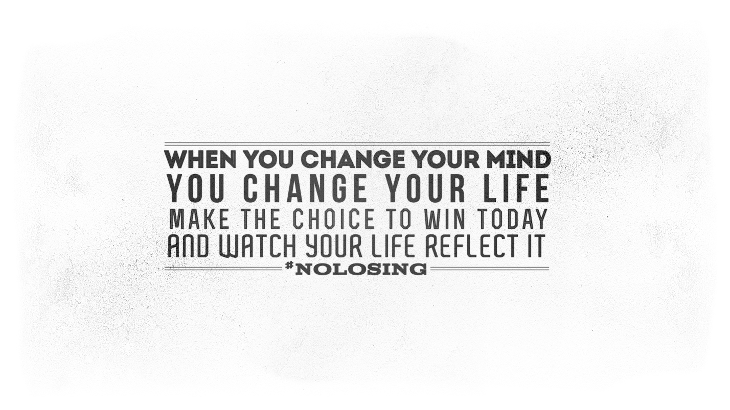
Change your mind; change your life.
Rule #1: Clarify the win.
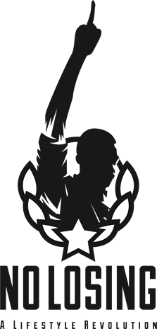
Brand Identity: Logo
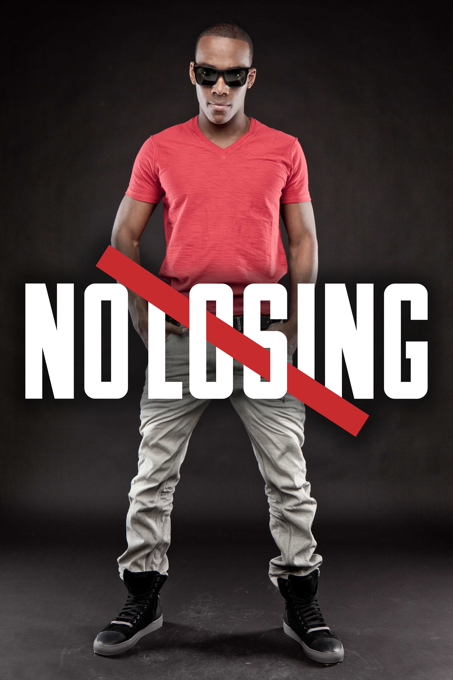
The No Losing Logo was designed as a logotype. After creating various concepts, we landed on a concept that merges the name with a backslash. The backslash became the hallmark and centerpiece of the logo and brand. We decided to incorporate a red slash over the name “No Losing” to represent the idea of a restriction sign. The idea was to create a brand identity that would elicit the same emotion people get when they see a stop sign. We wanted people to feel a sense of urgency about NOT losing in life.
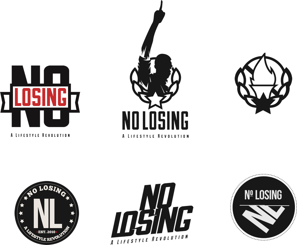
Before
After

Brand Identity: Color
The No Losing Color Palette incorporates a Rose Red as the primary color to represent urgency, emergency, and danger. This color was chosen because it embodies the passion and urgency of No Losing’s vision to make an impact on the lives of youth and young adults.
Rose Red
#C82B2D
Black
#0C0C0D
White
#FFFFFF
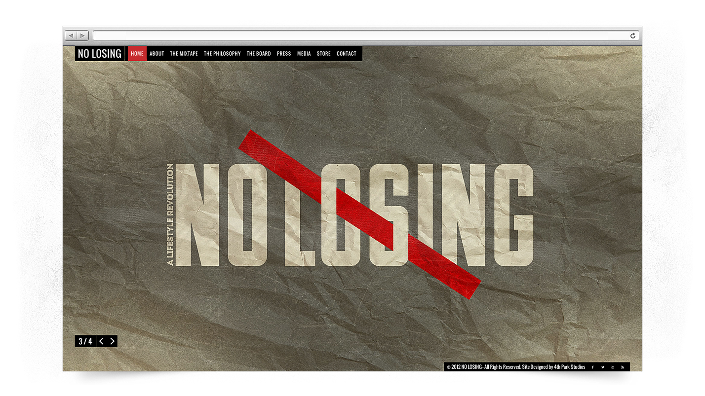
Brand Identity: Website
Our research consisted of studying other non-profit organizations who have successfully made an impact on youth in culture and learning about past accomplishments, current activities, and future goals of the No Losing organization. After having several conversations with the No Losing team, we were able to gain a deeper understanding that helped us develop the official website.


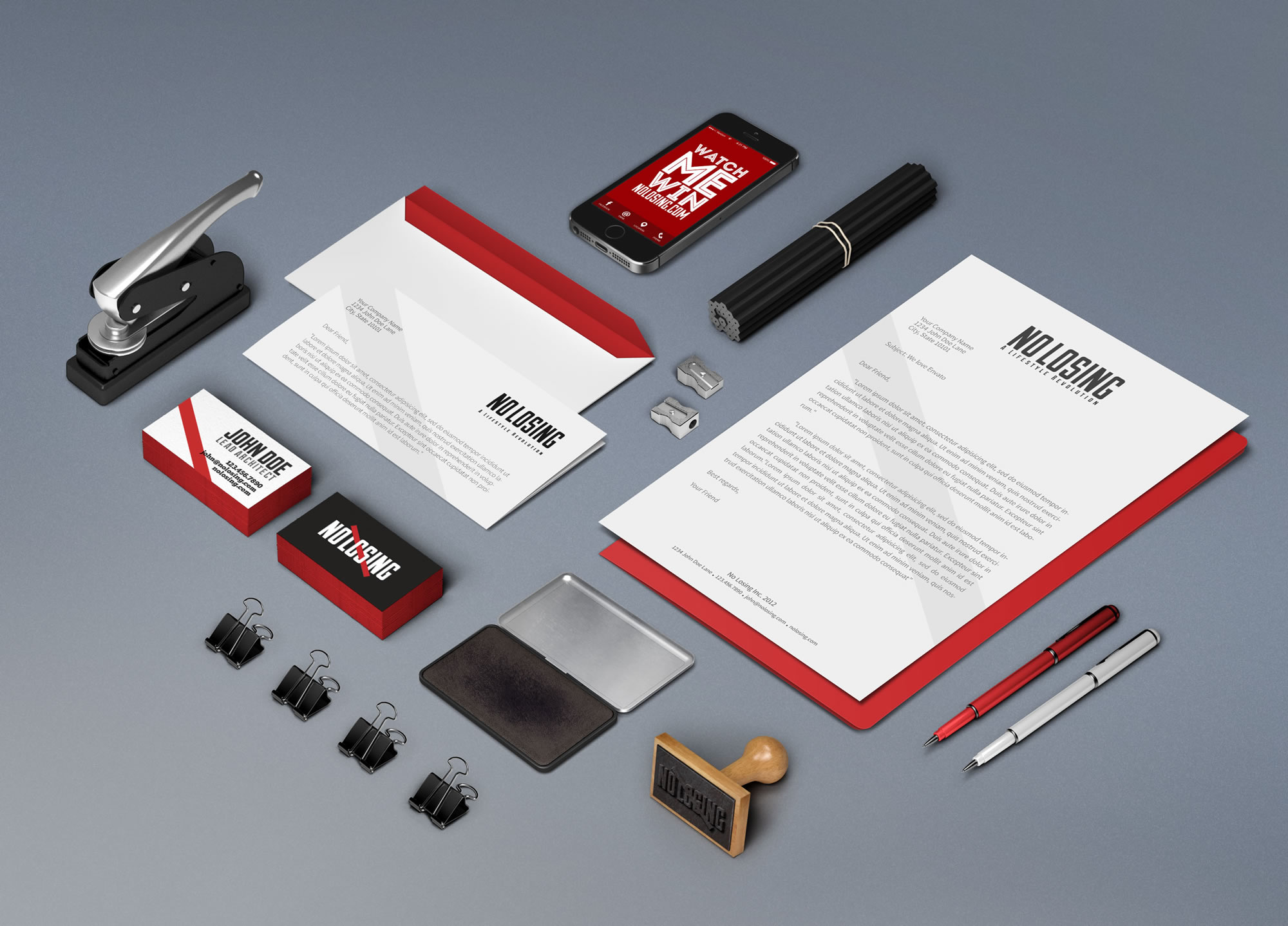
Brand Identity: Stationery
In the development of No Losing’s stationery set, a methodical approach was employed to align the brand’s visual identity with its core values. Central to this was the strategic incorporation of the backslash symbol within the stationery’s design. This symbol was seamlessly integrated into the layout and typography, ensuring consistency across all materials. Furthermore, No Losing’s brand colors were applied to maintain brand recognition and cohesion.

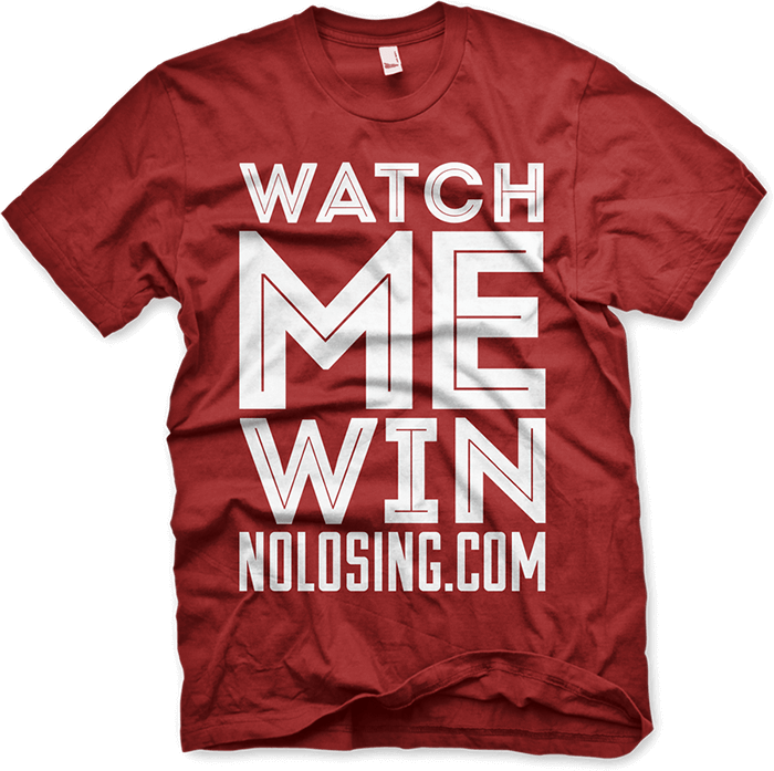
Promotional Material
We created a poster and t-shirt to promote one of No Losing’s campaigns called “Watch Me Win”. We utilized the brand colors and a distinctive font type with the objective of creating a typography style that embodied simplicity and boldness, aligning perfectly with the campaign’s message. We also designed visual assets to promote a series of No Losing events called “The Win”.